Navigate your way to success with proven website navigation best practices. Create a user-friendly interface that keeps visitors hooked from the first click!
Website navigation plays a crucial role in providing a seamless user experience. It serves as a roadmap that guides visitors through your site, enabling them to find what they need efficiently. Effective navigation not only enhances user engagement but also improves conversion rates. In this article, we will explore the importance of website navigation and delve into the best practices that can significantly enhance the user experience.
What is Website Navigation?
Website navigation refers to the system or structure that enables users to move around and explore different sections and pages of a website. It acts as a roadmap, guiding visitors through the content and functionality available on the site. Just like a well-designed map, effective website navigation ensures that users can easily find the information they are seeking, discover new content, and complete desired actions.
Analyzing User Behavior and Navigation Patterns
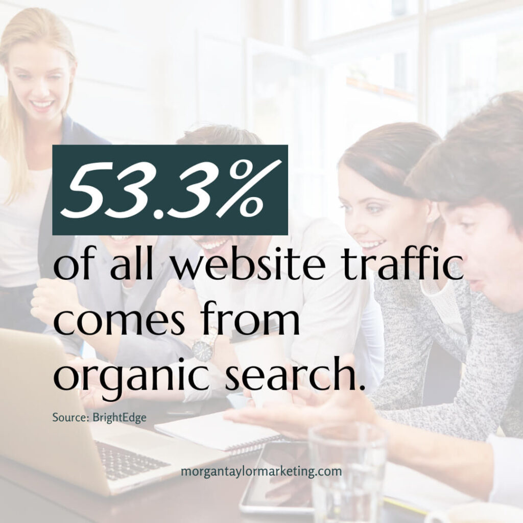
Understanding user behavior is essential for designing effective website navigation. By leveraging analytics tools, such as Google Analytics, you can gain valuable insights into how visitors interact with your site. Heatmaps and click-tracking tools provide visual representations of user activity, highlighting which areas of your site receive the most attention and where users tend to click. This information allows you to identify common navigation patterns and user preferences, enabling you to make informed decisions when optimizing your site’s navigation.
Best Practices for Intuitive Navigation Design
Creating an intuitive navigation design is crucial for ensuring a seamless user experience on your website. By simplifying navigation menus, using clear labels, organizing content hierarchically, and effectively utilizing drop-down menus and mega menus, you can optimize navigation and improve user satisfaction.

1️⃣ Simplifying navigation menus for easy browsing:
- Streamline your navigation menus by including only the most essential categories.
- Avoid overwhelming users with too many options, as it can lead to decision paralysis.
- Group related content together to create a logical and intuitive structure.
2️⃣ Creating clear and concise navigation labels:
- Use descriptive and straightforward labels that accurately represent the content behind them.
- Avoid ambiguous or vague wording that may confuse users.
- Conduct user testing to ensure the labels are easily understandable and resonate with your target audience.
3️⃣ Organizing content hierarchically for logical flow:
- Categorize your content into hierarchical levels to establish a logical flow.
- Place important and frequently accessed sections at higher levels for easy access.
- Use submenus or drop-down menus to provide additional layers of navigation when necessary.
4️⃣ Utilizing drop-down menus and mega menus effectively:
- Drop-down menus can be useful for presenting subcategories or additional options within a specific menu item.
- Mega menus, which display a grid of options, are ideal for websites with extensive content or complex site structures.
- Ensure that drop-down menus and mega menus are easy to navigate and don’t overwhelm users with too many choices.
Optimizing Navigation for Different Devices
In today’s mobile-centric world, optimizing website navigation for different devices is crucial. Responsive design allows your site to adapt seamlessly to various screen sizes, ensuring a consistent user experience across desktops, tablets, and smartphones. Mobile-friendly navigation should prioritize essential menu items and utilize collapsible menus to save screen space. Additionally, consider touchscreen devices and provide ample spacing between clickable elements to prevent accidental taps.
Implementing Effective Navigation Structures
Navigation structures play a vital role in shaping the user experience of a website. When implemented effectively, they improve usability, aid content discovery, and provide seamless navigation for visitors. In these sections, we will explore different type of navigation structures and their impact on the user experience.
➡️ Horizontal and Vertical Navigation
a. Horizontal Navigation:
- Widely used and familiar to users, facilitating easy scanning across options.
- Provides a linear layout that allows users to see all menu items at once.
- Well-suited for websites with fewer menu items or wider horizontal space.
b. Vertical Navigation:
- Works well for websites with long lists of menu items or limited horizontal space.
- Allows for a hierarchical structure that accommodates a large number of menu options.
- Provides ample vertical space for longer labels, reducing the need for truncation.
Choosing between horizontal and vertical navigation depends on various factors, including the website’s content structure, the number of menu items, and user preferences. Consider the trade-offs of each style to determine the most suitable option for your website.
➡️ Breadcrumb Navigation for Easy Navigation Tracking
Breadcrumb navigation is an additional feature that enhances the user experience by providing context and improving user orientation. It displays a trail of links that represent the user’s current location within the hierarchical structure of the website.
Benefits of breadcrumb navigation include:
- Backtracking: Users can easily navigate back to previous pages by clicking on the appropriate breadcrumb link.
- Higher-Level Navigation: Breadcrumbs allow users to navigate to higher-level pages, making it convenient for exploration or retracing steps.
- Contextual Awareness: Users gain a better understanding of their location within the website’s structure, improving overall orientation and reducing disorientation.
Breadcrumb navigation is particularly useful for large websites with complex structures, e-commerce platforms with multiple categories, or content-rich sites where users may enter at deeper levels.
➡️ Search Functionality and Its Impact on User Experience
Incorporating a prominent search bar on your website provides users with a quick and efficient way to find specific content. The search bar enables users to enter relevant keywords and retrieve results tailored to their search queries. Implementing advanced search features, such as auto-suggestions or filters, further enhances the search experience.
Benefits of search functionality include:
- Time-Saving: Users can bypass traditional navigation and directly access the content they seek, saving time and effort.
- Precision and Relevance: Advanced search features refine search results, presenting users with more accurate and relevant content.
- Flexibility: Search functionality accommodates users with different information-seeking behaviors and preferences.
By integrating search functionality, you empower users to find specific content quickly, catering to their unique needs and increasing overall satisfaction.

Navigation Placement and Visibility
The placement and visibility of navigation elements have a significant impact on the user experience and engagement. By strategically positioning navigation menus and utilizing techniques like sticky navigation, you can provide effortless access to important content and enhance user satisfaction. Let’s explore these best practices in more detail.
1️⃣ Strategic Placement of Navigation Elements
- Main Navigation Menu: Consider placing the main navigation menu at the top of the page or in a prominent sidebar. The top placement is a widely recognized convention, making it easier for users to locate and access the primary navigation options. Sidebar placement can be particularly useful for websites with complex structures or lengthy menus, as it allows for vertical space utilization.
- Secondary Navigation Elements: Position secondary navigation elements strategically to provide supplementary access to relevant content. Footer navigation can be beneficial for including additional links that complement the main navigation. It ensures users can access important information even when they reach the end of a page. Additionally, consider contextual navigation elements within specific sections or pages to guide users through related content.
2️⃣ Sticky Navigation for Effortless Access
- Sticky navigation, also known as fixed navigation, is a valuable feature that keeps the navigation menu visible as users scroll through the page. By remaining fixed at the top or bottom of the screen, sticky navigation ensures continuous access to navigation options, regardless of the user’s position on the page. This feature improves convenience, reduces the need for users to scroll back to the top to navigate, and provides a consistent user experience throughout the site.
3️⃣ Enhancing Visibility with Contrasting Colors and Icons
- Visibility is key to effective navigation. To make navigation elements stand out from the rest of the page, use contrasting colors that create a clear visual distinction. By employing a color scheme that complements the overall design while still providing enough contrast, users can quickly identify navigation options.
- Icons can supplement text labels and aid in visual recognition. Icons help users quickly associate specific actions or sections with familiar symbols. When using icons, ensure they are universally recognizable and align with users’ expectations. Combining icons with text labels creates a visual hierarchy that enhances the clarity and comprehension of navigation options.
Enhancing Navigation with Visual Cues
Navigation can be enhanced by incorporating visual cues that aid users in understanding and interacting with the navigation elements. Effective use of icons, highlighting active and hover states, and utilizing tooltips and context-based cues contribute to an intuitive navigation experience.
1️⃣ Effective use of icons and symbols:
- Integrate icons or symbols alongside navigation labels to aid in visual recognition.
- Ensure that the chosen icons align with users’ expectations and widely recognized conventions.
2️⃣ Highlighting active and hover states:
- Clearly indicate the active page or section in the navigation menu to provide visual feedback to users.
- Implement hover effects to indicate interactive elements and reinforce their clickability.
3️⃣ Utilizing tooltips and context-based cues:
- Tooltips can provide additional information or context when users hover over navigation elements.
- Context-based cues, such as subtle animations or micro-interactions, can guide users’ attention and aid in navigation.
Aesthetic Appeal and Navigation Harmony
Consistency in design and navigation style is vital to create a visually appealing and user-friendly website. By coordinating navigation elements with the overall aesthetics of your website, you can ensure a harmonious and seamless user experience.

1️⃣ Consistency in design and navigation style:
- Maintain a consistent visual style throughout your website, including navigation elements.
- Consistency builds familiarity, making it easier for users to navigate your site.
2️⃣ Coordinating navigation with overall website aesthetics:
- Ensure that the navigation design aligns with the overall visual theme of your website.
- Harmonize colors, typography, and layout to create a cohesive and pleasing user experience.
3️⃣ Balancing creativity with usability:
- While creativity is essential, prioritize usability and ease of navigation.
- Avoid overcomplicating navigation elements with excessive animations or unconventional interactions that may confuse users.
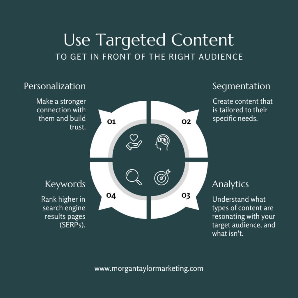
Navigation and SEO Optimization
Optimizing navigation for both user experience and search engine optimization (SEO) is crucial for driving organic traffic and improving website visibility. Here are key strategies to optimize navigation and enhance SEO:
1️⃣ SEO-friendly URL structure and navigation:
- Optimize your website’s URL structure to be descriptive, concise, and keyword-rich.
- Ensure the navigation hierarchy mirrors the URL structure to enhance SEO visibility and improve user understanding.
2️⃣ Internal linking strategies for improved discoverability:
- Utilize internal links within your website’s content to guide users to relevant pages.
- Internal linking improves navigation, encourages exploration, and helps search engines crawl and index your site.
3️⃣ Implementing breadcrumb navigation for SEO benefits:
- Breadcrumb navigation provides an additional opportunity for keyword-rich anchor text and helps search engines understand your site’s structure.
- It enhances both the user experience and SEO by enabling users to navigate up the hierarchy and reinforcing website relevance.
Usability Testing and User Feedback
Usability testing and gathering user feedback are essential steps in optimizing navigation and creating a user-centric website experience. By conducting usability tests, collecting feedback, and implementing iterative improvements, you can refine and optimize your website’s navigation.

1️⃣ Conducting usability tests to evaluate navigation effectiveness:
- Perform usability tests with real users to identify potential navigation issues or areas for improvement.
- Observe user behavior and collect feedback to validate the effectiveness of your navigation design.
2️⃣ Gathering user feedback through surveys and interviews:
- Seek feedback from your website’s visitors through surveys or interviews to understand their navigation experiences.
- Ask specific questions about their ease of navigation, clarity of labels, and overall satisfaction.
3️⃣ Iterative improvements based on user insights:
- Continuously analyze and interpret the data collected from usability tests and user feedback.
- Implement iterative improvements based on the insights gained to refine and optimize your website’s navigation.
Remember, a well-designed navigation system not only improves user satisfaction but also contributes to the success of your online presence. Implement these best practices and embark on a journey toward a seamless and user-centric website navigation experience.